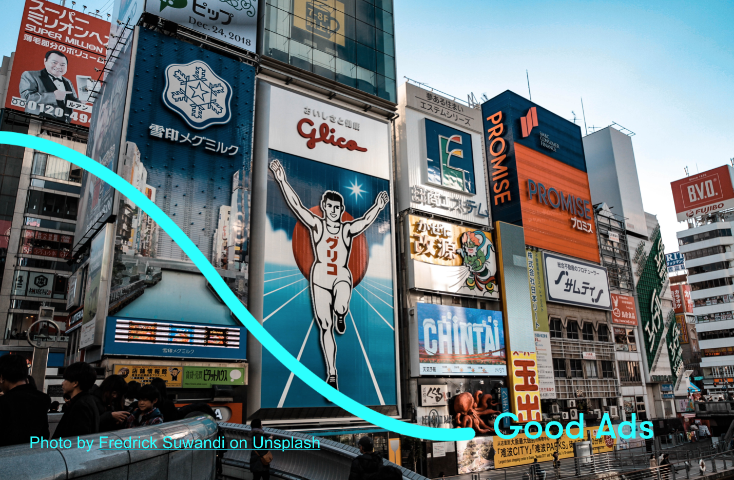
I have recently posted an answer on Quora on what is an artwork and what makes it effective. I take it as a sign that despite experiencing lock down, businesses are thinking about the reality post quarantine.
First, I expect you would be letting your customers know that you are back to trading, or inform their customer base of the change in doing business. The talks around the business community is that many of the businesses will use the lock down as an opportunity to review the way they trade and many will never go back to the old way of trading.
This change will likely have to be communicated.
There will be some great deals to be had for those who are able to react quickly. So use this time to work out your communication and have the ads ready to launch as soon the lock down is over.
There will be some great discounts to be had out there whilst the ad market is recovering, but to make the most of any ad deal out there, you need good artwork.
The artwork (composition of an ad) will differ depending on where it’s being shown.
For example outdoor advertising requires more discipline as oppose to print ad, leaflet or online banner
There are couple of best practices that apply to most channels:
Make sure your product is at the centre of the artwork and the picture clearly shows what it is and what it does. This is the trickiest part and it’s the bit most beginners get wrong. Involving an agency at this stage will save you a fortune and will serve as a template for your future activities. It’s super important for your brand to get it right at the start and keep building on it.
As a guide go with 50% + 30% + 20% rule:
Image or Typography – taking 50% of the space
- So if it’s a shampoo in a spray – which makes it different from other shampoos, it should be clearly visible on the image.
- If it’s a software – show the bit, that sets you apart from everything else on the market.
- If it’s a great price – then that would be the core of your artwork and should take up 50% of the space.
Big Font texts ( or Typography) of max 3 – 5 words explaining what it is. Taking another 30% of the space.
Stick to the 3-second rule. If you cannot read it in 3 seconds it’s probably too long.
The remaining 20% is your free space and small text.
A smaller text can be included but by this point you would have done your selling and it’s just extra information – like disclaimer, details of the promotions, availability of the product etc.
Beware of:
- including too much information – ad is for grabbing attention or brand building. If you have a long story to tell and copious details to share – opt for content marketing or advertorials.
- reusing print ads or a leaflet for a poster or billboard. Unless its high contrast and bold, a print ad will not stand out enough in a city environment
- trying to communicate too many things with a single ad. Stick to one goal and execute it well.
- make sure people can see the branding. How many times have you seen a wonderful visual and then have no idea of the branding as it was too small?
In a nutshell, in advertising artwork, the less is definitely more.
